Sometimes the readers of this newsletter think I’m actually a full-time content creator or a trader/investor. I barely trade my positions, I do at most 3 key trades a year? I also spend less than 3 hours a week maintaining this blog. So what do I do full time then? I’m the founder of a crypto-data startup that aims to make on-chain identity real. That’s not official but just a quick TLDR for ya’ll. I wrote a bit about our new product offering a few months ago if you want to understand more.
I’m keen to write a bit more about what I do since it’ll give you more context as to how we aim to solve some of the problems that I write about on this blog at a more regular cadence! Okay so what’s new in our new release? Well fundamentally it’s all about going much deeper with the amount of on-chain information we have powered in our products. We now actually have in our data warehouses, every:
-
Block
-
Transaction (raw and decoded)
-
Trace/Internal Transactions (raw and decoded)
-
Event Logs (raw and decoded)
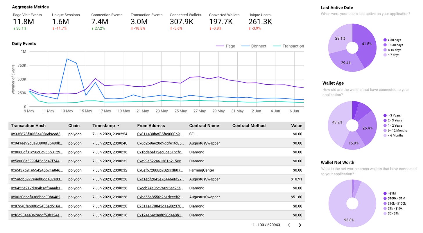
Since the beginning of time, for both Ethereum and Polygon with more EVM chains soon(tm). What this allow us to do is some really novel things with understanding user behaviour and identity. I’ll do a brief showcase of each of the new features below.
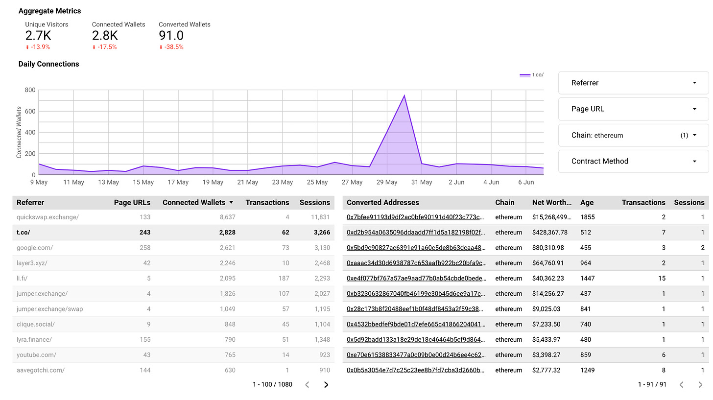
One of the tabs of the dashboard is helping dApps understand where their traffic is coming from and what the quality of it is. Let’s take a look at the screenshot below. What we’ve done below is filter:
This is really helpful since you get a more granular breakdown of what’s actually going on with marketing efforts. Most graphs in analytics products you see don’t let you drill down or go a layer deeper. We’re different. The main takeaway here is that we can actually help dApps understand whether the efforts they’re putting into marketing actually are delivering them the kind of users they want. I’ve written extensively about why raw user counts don’t matter here:
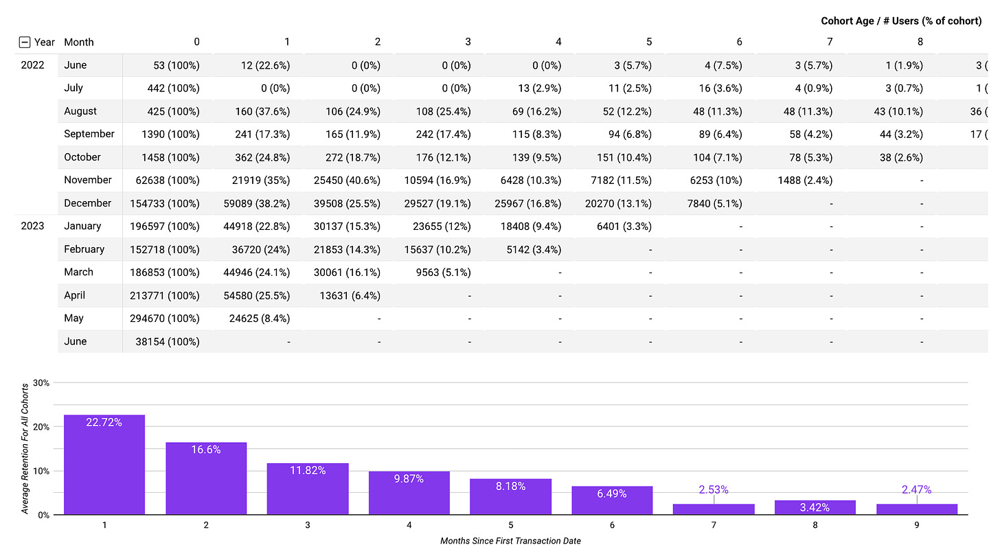
We’ve overhauled the retention data we’re able to provide in the latest version as well. It’s still a bit basic relative to where I’d like to take this in the future but at least we have standardised ways of understanding how sticky users are in a dApp. Because we have numerous dApps currently using this, I’m able to start to see aggregate benchmarking data for what a great dApp looks like versus an average one. I’ll probably write about this in another article as well.
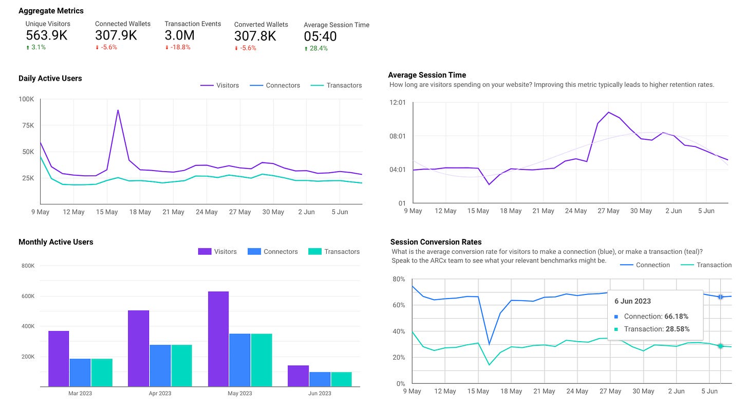
I could write an entire article on the learnings from this part of the dashboard but I’ll try to keep it as brief as possible. We’ve been intentional with this part of the app by ensuring we really differentiate between:
-
Visitors (people who simply visit your dApp)
-
Connectors (people who actually connect their wallet)
-
Transactors (wallets that make transactions on the front-end)
In the first graph we can start to see how the traffic is broken down depending on whether a large influx of visitors actually converted to connectors and transactors. As another way of viewing that relation, the graph in the bottom right corner lets you see see that as a percentage over time. The dip you see indicates that on the day of the spike, conversion rates dropped but then rebounded as the influx of new users settled. Once again, given the large enough sample size of dApps we have, we have bench marking for what excellent conversion rates look like across the industry.
Last but not least, average session time is a great way to track the health and understand how long users are spending on a dApp as a gauge for how sticky they are.
We’re rolling this out to existing users as of now although the next version of ARCx (v6) is going to be a significant overhaul and I think is going to be something that will push the entire industry forward given the scale and polish it’ll have around it. I may or may not leave hints about what it will be able to solve with some of the articles coming out. If you’re interested in signing up/learning more, check out our website at https://www.arcxanalytics.com.
Read More: kermankohli.substack.com


 Bitcoin
  Ethereum
  Tether
  XRP
XRP  Solana
  USDC
USDC  Dogecoin
  Cardano
  TRON
TRON  Lido Staked Ether
  Wrapped Bitcoin
  Sui
Sui  Wrapped stETH
  Chainlink
  Avalanche
  Stellar
  Hyperliquid
  Shiba Inu
  Hedera
  LEO Token
  Bitcoin Cash
  Toncoin
  Litecoin
  USDS
USDS  Polkadot
  WETH
WETH  Monero
  Bitget Token
  Binance Bridged USDT (BNB Smart Chain)
  Wrapped eETH
  Pepe
Pepe  Pi Network
  Ethena USDe
  Coinbase Wrapped BTC
  WhiteBIT Coin
  Aave
Aave  Dai
Dai  Bittensor
  Uniswap
  NEAR Protocol
  Aptos
Aptos  OKB
OKB  Jito Staked SOL
  Ondo
Ondo  BlackRock USD Institutional Digital Liquidity Fund
  Cronos
  Tokenize Xchange
  Ethereum Classic